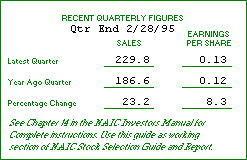
On the graph in Section 1, you will plot Earnings, Sales (Revenues) and Prices from the company's past ten years.
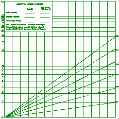
The first thing you will notice when you look at the graph is that is doesn't look like the graph paper you buy at the stationery store, with neat, evenly spaced squares. This is a semi-logarithmic chart, sometimes known as a ratio chart. The important thing you need to know about a semi-log chart is that it shows you the percentage changes from year to year, rather than the absolute numerical changes.
In other words, a trend line connecting 1 and 1.5, a 50% increase, will appear exactly the same as a line connecting 1,000 and 1,500, also a 50% increase. If these figures were charted on a regular chart, the increase from 1,000 to 1,500 would appear to be much larger than the increase from 1 to 1.5, even though they both represent a 50% change. A consistent percentage change will plot on the semi-log chart as a straight line.
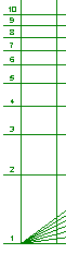
On the left side of the chart, the scale begins at 1 and goes up to 200. Since you are only interested in percentage change, these numbers can represent any number you designate: 1 can be 1, 10, 100, 1000, or 10 million. You will be plotting three items on the chart--sales, earnings per share and price--and each can be plotted on its own independent scale. Sales of $1 million and Earnings Per Share of $1 could both be plotted on the 1 at the bottom of the chart. (In practice, however, you will probably want to chart Sales and EPS on different scales for clarity).
It may be helpful to think of simply moving decimal places when you enter data points on the graph; 1800 becomes 1.800, 0.32 becomes 3.2, and so on.
The vertical lines of the chart represent years. The thick line about a third of the way from the right side of the page is for the most recent year. You will chart ten years of historical data and then project results five years into the future (1994 in this case).

The first step in plotting the data is to plot the company's revenues from the past ten years on the graph. Since a company can grow its EPS over the long term only by increasing its Revenues, you should plot Revenues first. If the picture you see of Revenue growth is not favorable, perhaps it's time to find another stock.
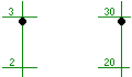 According to this company's Annual Report, Revenues for 1985 were $289.7 million. By adjusting the scale (i.e., moving the decimal point) we can plot this figure on our graph on either of the two scales on the SSG, as 2.897 or 28.97, as shown.
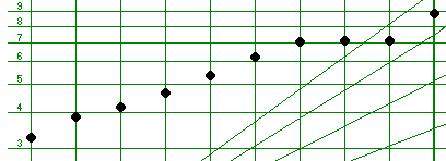
Let's use the upper scale for Revenues, plotting the next year's sales of $338.9 million as 33.89 on the vertical line for the 1986 year, about a third of the way between the horizontal lines marked 30 and 40. Continue in this manner until you reach 1994, with Revenues of $815.6 plotted as 81.56, just a bit above the vertical line marked 80.
We'll do the same for Earnings Per Share, this time using the lower scale and moving the decimal point one place to the right, so 1985 EPS of $0.33 turns into 3.3, 1986 EPS of $0.39 becomes 3.9, until we plot 1994 earnings, $0.89 as 8.9. When you're finished charting EPS, your chart should look something like this:
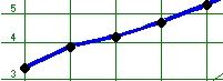
The next step is easy: just connect the dots! Draw a line between the data points for Revenues and another between the points representing Earnings Per Share. It may be helpful to use a different colored pen or pencil for both Revenues and EPS. Don't forget to mark in the margin which data are EPS and which are Revenues.
Finally, you will plot the high and low prices for each year, in much the same manner, except you won't connect the points from year to year. You will, however, draw a vertical line between the high and low price for each year. In this company's case, in 1985 the low price was $4.75 and the high price was $6.75, so you can plot these two points on the line for 1985 as in the following example.
 You will continue plotting the prices in this manner for the next nine years.